Welcome to my blog. I don't update often but maybe you'll join me anyway? Read some posts or something.
Napa Valley winetasting trip
My wife and I celebrated our fifth wedding anniversary earlier this month.
It’s so very weird how fast time flies.
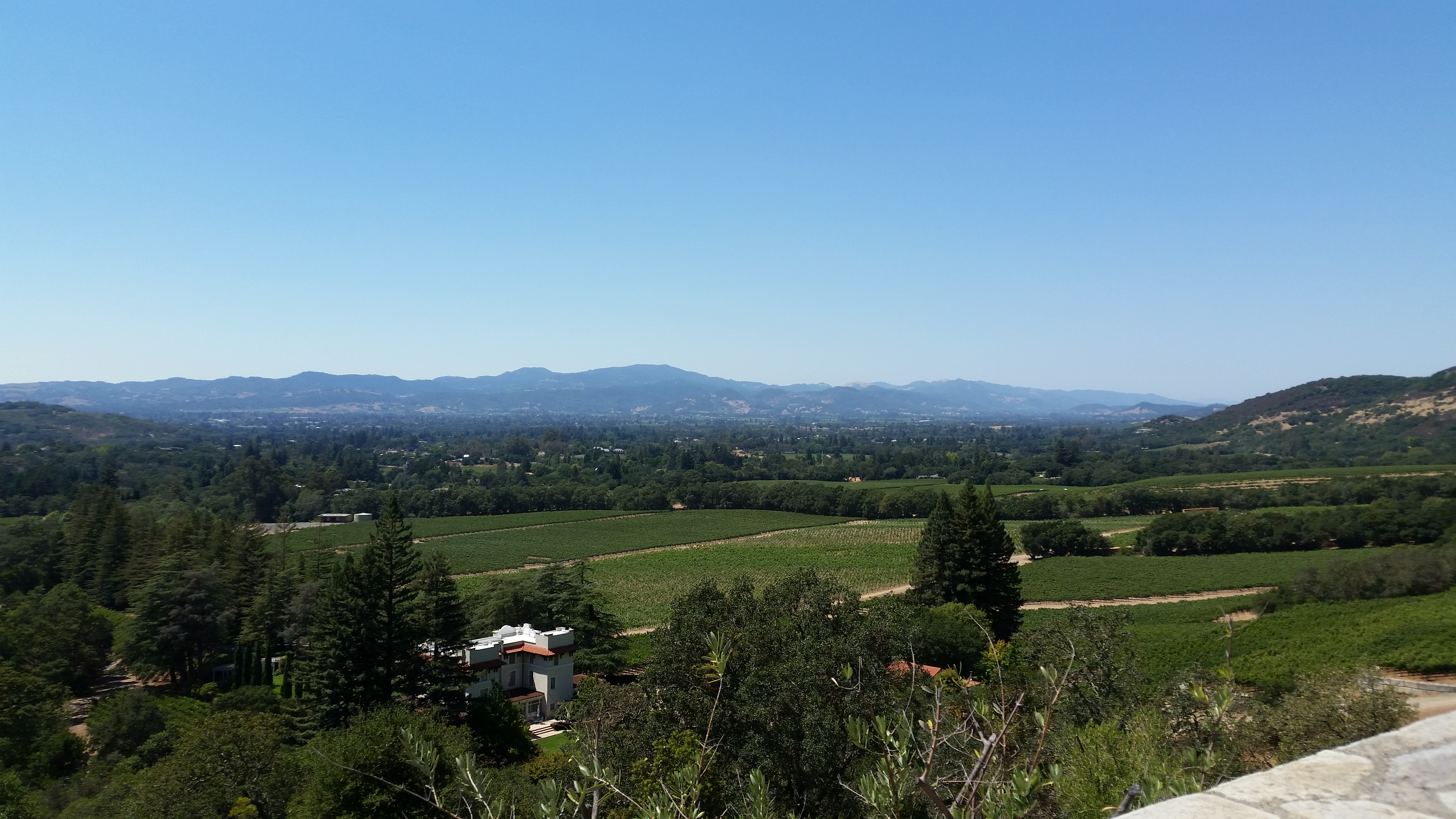
We went back to Napa Valley (where we had part I of our honeymoon) last month to celebrate our five year anniversary. It was the opposite of suck. I mean, look at this view! Last time, we stayed in someone’s charming AirBnb guesthouse and shared our outdoor space with chickens and goats. This time, we stayed in a pretty damned sweet boutique hotel right in downtown Napa and shared our outdoor space with older couples, roving bridal shower parties and also roving packs of inebriated and shouting techbros in from Silicon Valley. A good time was had by all.
It’s weird to think of where I was five years ago, let alone ten. An event happened last year that I don’t have the heart to write about just yet because it’s too raw. Some other time, maybe.
Two years ago, we moved to the same Portland neighborhood where our wedding was held, and in fact the wedding venue is now our local park. When we pass the gazebo overlooking the rose garden on the south end of the park we make sure to tell our daughter August that we were married there. Now she reminds us each time we go, which is very often.
In fact, my wife’s close friend and maid of honor visited us this last weekend and we all went back to the park. In stark contrast to the sedate but lovely affair from five years + a few days ago, the park was the setting for a joyously raucous and enormous family reunion. Our youngest son went into the fountain, wading waist deep for a happy while, and decided to reach for something by his toes which caused his entire face to become completely submerged for one agonizing second. I scooped him up quickly, so no worries there, but he did cough and sputter.
Our son’s great. Our daughter is great. My wife is great. My job is challenging but in a good way; I like helping build something lasting that will give back to the Portland community.
Backyard Chickens are back!
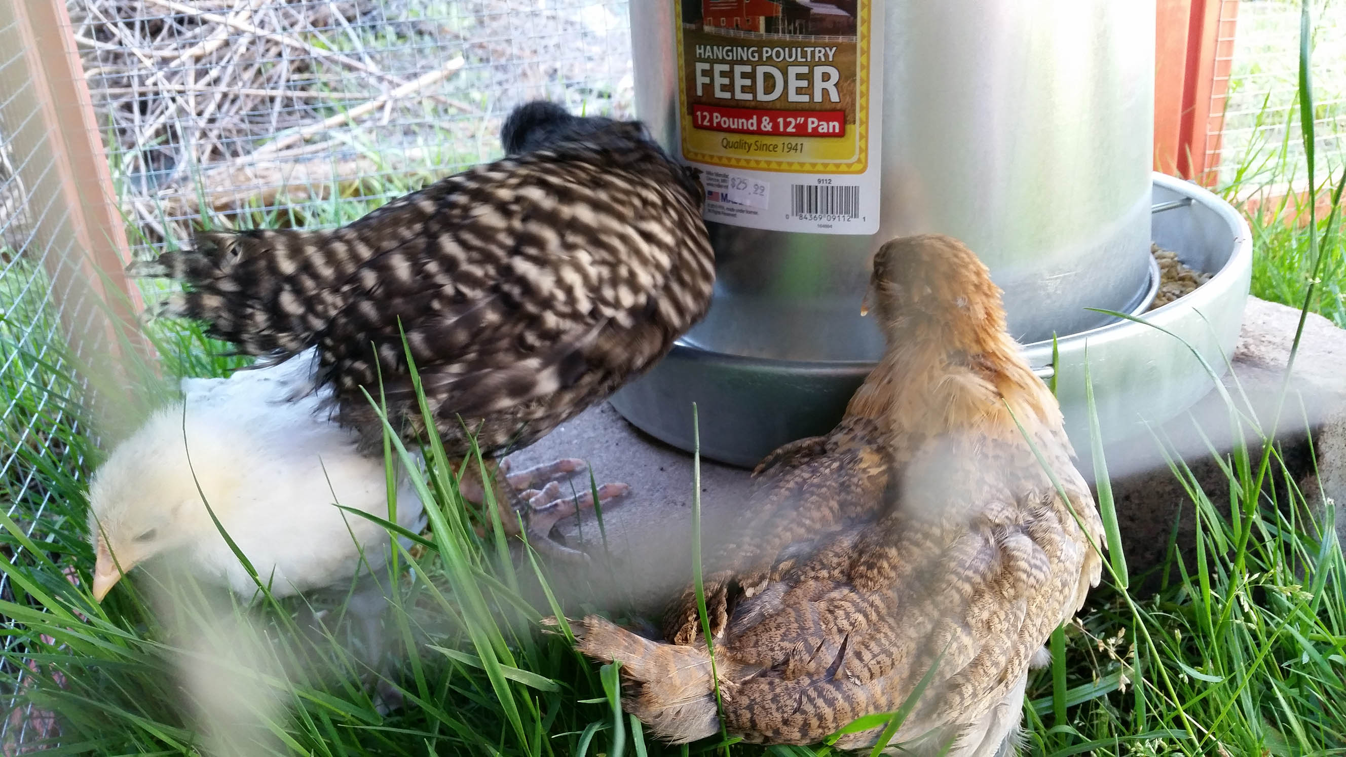
In an effort to not be “out Portland”-ed, we are trying chickens one more time. From left to right: Prince, Pokey and Khaleesi. My wife named Prince because, you know, it’s topical. My daughter named Pokey after a bedtime story my wife made up for her about a whale named Pokey who got lost and I named Khaleesi because she is the Mother of Dragons and she will eventually lay cool green eggs.
Our previous attempt failed due to raccoons (I chased them off one night and let me tell you: cutest murderers EVER) but we had the chickens for a good long while. Now we have a smaller and more predator-proof enclosure and in true Portland fashion we picked up our chickens out of the back of a truck at a Walmart parking lot. Shady chicken sales in the parking lots of Walmarts are how we roll around here, I suppose.
Anyway, here’s hoping these little guys have long and fruitful lives with us. The kids sure love them.
New year, new mobile-first redesign
As I have done a number of times in the past, I have redesigned my web site; this time around, I went with a mobile-first redesign. The process wasn’t daunting. I do this every few years to allow me to do new things; I don’t often do this on client web sites because they don’t pay me to learn, they pay me to design a site that their end users will enjoy using.
A personal site redesign is something I also do so that I can gauge the level of my own design abilities. One should constantly improve their skills after every site done and I always push myself to create something that’s in the “state of things” so that I know where I’m at.
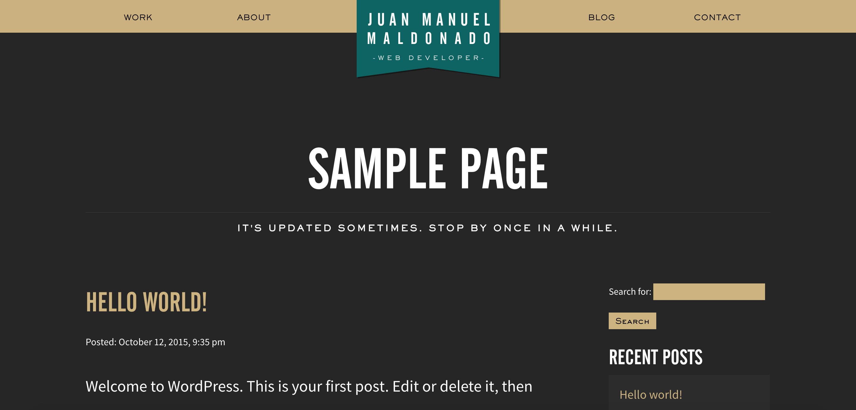 This isn’t a huge redesign, as you can see. It’s more of a simplification, a restatement, of the previous design which I am quite fond of even if it wasn’t implemented in the best way. As I constantly tell my students, web design is something you continually improve on, little by little, to the point that an evaluation of the code you wrote in your previous project should cause embarrassment. My sins were many: I used <div> tags and CSS classes like my life depended on them. My PHP code contained a lot of procedural code mixed in with some of the object-oriented code, which is referred to as “spaghetti and meatballs” code. That got fixed and quick.
This time around, I also implemented some social sharing in the form of Open Graph tags + the sharing widget from my old stomping grounds, Janrain. Since I now teach CSS pre-processors, I gave up my reticence about them and now I just can’t stop using them. So, I used LESS as my pre-processor as I’ve done in my last couple of projects and I am a convert. I also created a responsive web page but certainly not one that was designed with mobile-first design principles. Ironically, I adopted this design philosophy right after my last site redesign, and with total consistency.
How to do a mobile-first redesign
The answer is simple: you don’t redesign for mobile-first; you have to design mobile-first from the beginning or not at all. You can’t magically sprinkle magical mobile-first fairy dust on a site with left and right floats and fixed widths. Mobile-first means just that: you have to design your web page in a mobile resolution first, and then once the design is locked down, you then can increase your resolutions and see what elements of the mobile design work for your new resolution (usually this is for a tablet in portrait orientation, or for a very large phablet).
These are some loose guidelines for designing mobile-first:
- Use em/percentage sizes for everything. Only your body tag should have a fixed size. This way, if you increase your body tag’s default font size in a later media query, all your em heights will increase accordingly.
- While we’re on the subject of font sizes, make sure your text is easy to read on a mobile phone. This is a no-brainer. If your end user has to squint to see anything, you done goofed.
- Images shouldn’t have width and height attributes in the HTML anymore. Nope. No more. Why did you really use those, anyway?
- All major structural elements should be 100% wide. No more columns in your designs, at least not in a mobile resolution.
- If a navigational element is too small to be tapped on with a thumb, it’s too small. End of story. Make those navigational elements bigger. No, bigger. Bigger still. There you go!
Once your site is locked down for mobile, you use media queries at the end of your CSS cascade that build on the mobile CSS you wrote for larger resolutions. What kinds of things do you change up as the resolution increases? Well, there are some fair consistencies that you can account for. When you design for a mobile-resolution width, your 100% wide structural elements create a good amount of vertical scroll, which is a completely OK user experience since scrolling is something you can do with a simple flick of your thumb. When you increase the width of the screen, you now have a lot of horizontal stretch. You need to do several things to bring your vertical-to-horizontal ratio back in check:
- Increase the default font size just a touch, usually from 16px to 18px. If you used em sizes for all your font/padding sizes, and you should have, then they will fall into place accordingly.
- Increase the amount of padding in your structural elements. Maybe 1em was enough for mobile, but you may want to try 2em or even 2.5em and see how that goes. Increasing your default font size will help, but maybe not enough.
- Increase the line-height of your main blocks of text. Usually this is just your paragraphs and your list items.
- Finally, if needed, use a responsive grid to set breakpoints and get your structural elements smaller and next to one another so that you don’t have so much wasted whitespace on your page. I highly recommend Responsive Grid System with a 12 column grid, since it presupposes no styling and it doesn’t require a big bloated CSS framework to get up and running. 12 is a good number because you can generate 12, 6, 4, 3, 2 and 1 column widths to approximate 100%, 50%, 33.333%, 25% and 12.5% columns widths and everything in-between very quickly.
Your CSS right after your initial mobile CSS should look a bit like this:
@media screen and (min-width: 481px) {
/* add exceptions here... */
    body {
        font-size: 18px;
    }
    header, footer, main {
        padding: 2em;
    }
    p, li {
        line-height: 1.8em;
    }
}
Your responsive grid CSS should also kick in, moving any elements next to one another comfortably.
View the source of this web page to see what I mean. It’s all there… one thing that you might find interesting (humble-brag incoming) is the relative lack of HTML and CSS to achieve the page’s design. Mobile-first design allows you to write simpler user interfaces using less code. Less code means less things that can get goofed up and cause headaches. Less headaches means more time to make your web pages beautiful.
Portland Community College
I looked at my site recently and saw that I hadn’t updated since December 2013. That’s not fun!
Truthfully, I’m starting to rethink even having a blog. Because it’s not a niche blog it gets no hits, and there’s better ways to do blogging out there anyway. Maybe I’ll put this on moth balls and start a UX/UI-related Tumblr account.
Until I make the decision to pull the plug on this blog, I should mention a few things that are going on with my life.
The happenings
The first is that we have a son! He was born on Pi Day and his name is Simon and he’s a very sweet little guy. Very easy going and he loves to smile and laugh. Once he has your attention, he likes to talk about such interesting topics as uhhhhh, agooo, and guhhhh.
Our daughter doesn’t look like she does on the front page of my site anymore. I say this a lot nowadays because students visit my site. She’s no longer a baby and in many ways, not a toddler either. She loves to yell at the bees in our back yard and smear Play-Doh on things.
Wait, students?
Portland Community College
Oh yeah… I’m proud to say that I am now a full time instructor at Portland Community College, teaching web development and design. With a heavy heart, I left Janrain in August of last year. If you recall, I went back to school and finished my undergraduate degree for one purpose, which was to return to education… and a position opened up at PCC. I wasn’t even job hunting at that point (but I DEFINITELY was about a month later). I saw the posting on New Year’s Eve… I don’t even remember what I was doing or how I found the posting but I applied immediately. After months of waiting and rounds of interviews, I was offered the position. To facilitate this life change, I had to turn down a more lucrative job offer at a large, very well-regarded and at least in this blog, unnamed startup based in downtown Portland just for the chance to get this PCC position. My wife is awesome; it was within her rights to veto this decision but she endorsed it wholeheartedly.
Portland Community College is a well-regarded institution in town. There are four main campuses; I’m at the Rock Creek campus. My commute takes me over a river, through a forest and over a mountain to a farm in the Tualatin Hills that happens to have a college campus next to it. It’s a long commute but it’s scenic.
So, what’s it like being back in front of a classroom after an eight year hiatus, working with adult learners? Feels good, man. You know the show Community? Well, it’s exactly like that, right down to the weekend long games of “the ground is lava” and alternate timelines.